
“The best way forward is the blended comprehensive approach which puts containment as a major pillar.” — Dr. Tedros Adhanom, Director-General of the World Health Organization.
Researchers from the Indian Institute of Technology Gandhinagar have come up with an interactive means to tackle some crucial aspects of the current pandemic. The main objective behind this research is to help administrators, hospitals, and the public, efficiently plan the containment of community infection under different post-lockdown conditions.
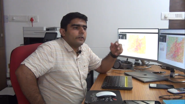
Dr. Udit Bhatia, a faculty in the Civil Engineering discipline of the Institute, along with Dr. Prasanna Venkatesh B (faculty, Physics) and a team of students have developed the MIR AHD COVID-19 Dashboard. Dr. Deep Chakrabarti from King George’s Medical University (Uttar Pradesh) has also been a part of this collaborative study and is advising the team on various clinical characteristics of this viral illness.
What is it?
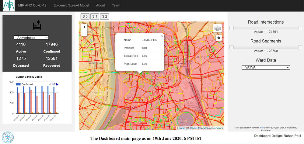
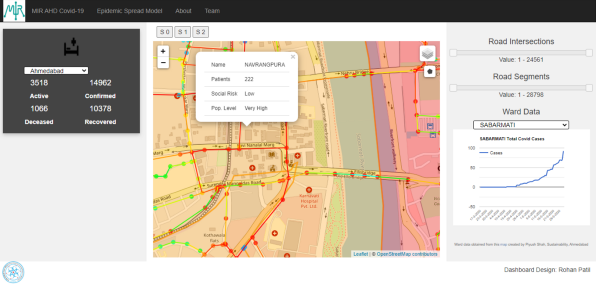
Given the rate at which this notorious virus is wreaking havoc with its infection spree, the Government declared several regions of the country as containment and super containment zones during the lockdown stages. With stringent perimeter control and limited essential services available, these areas highly affect the travel patterns throughout the cities. This project is an information dissemination platform which can provide important details to people about how the SARS-CoV-2 infection is spreading in their city.
This facility is not only applicable at a city-scale but is also accessible in their respective wards. Specifically speaking about the stakeholders, they will be able to get an idea of how the trajectory of spread is going to be impacted in the future with various lockdown strategies (having different levels of strictness and relaxation).
“Basically, this technology assimilates all critical information about the current ongoings at the policy-level. This data is fed into a mathematical model, which in turn gives projections about how the city is going to look like in terms of the pandemic progression as well as the road-traffic congestion that may happen when cities slowly return to their normal routine after the lockdown is lifted,” said Dr. Bhatia.
A Multi-Purpose Platform
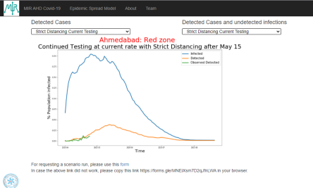
Explaining further, he stated that this multi-utility dashboard generates information that would cater to three major types of audiences — the general public, healthcare professionals, and stakeholders. Moreover, since it is an interactive platform, users can explore its diverse functions with the help of sliders and tabs. For example, in order to gain an understanding of how this disease will progress if we have, say, more restricted lockdowns, there is an option with multiple sub-options such as loose (social) distancing with enhanced testing, strict distancing with current testing, and so on.
Figures will get generated accordingly when the user clicks on one of these tabs, and they will get information about vital aspects like the peak-time and spread-rate under a particular scenario.
“As the COVID-19 situation is continuously evolving, we realized that while it is a global crisis, the solutions needed to fight it should be at a local scale. If we look at India, the kind of heterogeneity that we have in our population distribution points that each city will behave in a different manner. We are observing different kinds of follow-ups coming from different cities in response to the implementation of the same policy guideline. All this gave us an idea that we need to focus on a much smaller (micro) scale as compared to targeting the (macro-scale) national-level efforts. This is how we started looking at the COVID-19 characteristics of Ahmedabad, which was categorized as a hotspot with multiple red zones by the Government, as our first testbed to effectively model the spread of a pandemic at a city-scale” expressed Dr. Bhatia.
Its Input Sources
This model gives forecasts and hence requires credible data as an input. It gets this raw information from the Ahmedabad Municipal Corporation website that publishes daily counts of the number of positive cases, fatalities, recovery numbers, etc. In terms of modeling the travel patterns, extensive travel preference surveys (which are conducted before starting services like metro planning in a city) serve as an input. Based on one of these survey reports, the most preferred routes were identified to model the congestion when the city resumes its normal functions post-lockdown.
Dr. Bhatia’s work as a research scholar mainly revolved around network congestion and its recovery modeling, which was also patented. The visualizations generated by this dashboard engine are based on the same US patent technology. It tells us that if a network is disturbed at a specific location, how rerouting will happen, and what would be the new potential congestion zones.
While talking about the spread of any infection or disease, the socio-economic condition becomes one of the most vital factors to be considered in governing how the illness will progress. It can be understood with the following example. The probability of a faster disease-spread is much higher in a densely populated area as compared to a sparsely populated one. This kind of data came from the census 2011 report as well as from certain open-source agencies that carry out estimations of the world population. Eventually, data from all these sources was funneled down into the mathematical model of this dashboard to generate the outputs.
The number of cases in certain parts of Ahmedabad may appear to be low at present. But the kind of socio-economic factors that these areas have, such as the prevalent rate of poverty, lack of adequate housing, hygienic washrooms, and so forth, can contribute to the risk of COVID-19 spread in a drastic fashion. These are high-risk regions. This dashboard tries to inculcate such parameters into its framework so that it can predict scenarios like the rate at which this infection can double itself in a specific location and similar dangerous situations.
An Emphasis on Privacy
“There are no security concerns with our dashboard,” Dr. Bhatia assured when asked whether this platform is safe in terms of maintaining the privacy of individual user data. “The information that we are using here is coming from an aggregated level and it is not the personal data from individuals. The dashboard is safe to the extent that it does not even keep track of the user history. Furthermore, most of the concerns about personal data protection arise when people have to input their details like health status and location. Since it is not a typical individual monitoring app, it does not function on that type of information,” he elaborated.
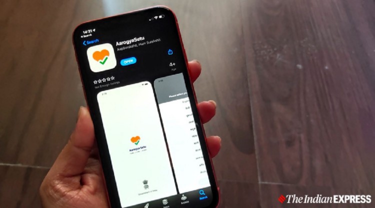
Discussing India’s famous Aarogya Setu app, he described that while on the one hand, the app lets us take individual health assessments and informs us if there are any infected cases in our vicinity, this dashboard, on the other hand, aggregates this type of information and processes it to provide other details. Say, if there are ‘x’ number of cases today in a particular area, what is the projected number of cases that this area can have in the next 90 or 180 days? “So, it can be said that the output of the Aarogya Setu app can be the input for our dashboard, but these two platforms are two very different ways to address this giant problem,” he added further.
Uniqueness and Future Prospects
The basic set of equations and algorithms of this dashboard’s epidemic spread model can be easily applicable to diseases like flu. Both flu and COVID-19 are contagious. But the kind of tweaking made for using this project specifically in the existing situation was informing the model about the clinical details of the novel coronavirus disease. For this purpose, the team has collaborated with doctors that guide them on various parameters of this viral illness. Essentially, for monitoring another infectious disease, the basic structure of the dashboard will remain the same and only the parameters will need to be modified!
This study is unique in terms of the scale at which it can effectively function — the sophistication of local interactions being fed into this model and the levels of outputs it can generate. All this was a little tricky to achieve in such a short time span. The world is caught in the middle of a crisis and we don’t have the time to take it slow! Many similar projects have been carried out in the past, but they were on a much larger scale. Also, talking about the city-scale studies, they are extensively data-hungry, and typically this type of data is not available for Indian cities. Putting all these aspects into perspective, the IITGN research team started looking at the feasibility of such a study based on their understanding of networks.
After about 45 days of tireless efforts, the 10 team members came up with a new framework capable of generating these important predictions. This research utilizes datasets from open-source resources. Such data from other cities can be used to generate outputs for them as well. Not only several cities from India but also some stakeholders from Germany and Africa have approached this research team to develop similar exercises for their regions.
APEKSHA SRIVASTAVA
Senior Project Associate